



On October 7, a drone struck a Yandex data centre in Russia.
Yandex said the site was seriously damaged and completely shut down. More strikes followed in the subsequent days, demonstrating the significance of their role as a nation’s critical infrastructure and suggesting they may become wartime targets in the future.
Soon after, an image went viral almost as fast as the footage of the fire: a Cloudflare Radar chart in which one line had plunged off a cliff following days of attacks on three centers.
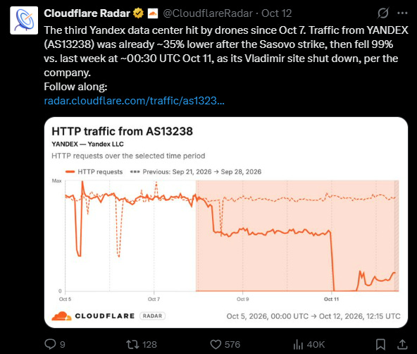
The news story it seemed to tell was irresistible: Ukraine had not merely broken a building, it had made the internet quieter!
Speaking in Warsaw on October 12, Volodymyr Zelenskyy said that after the strikes “it suddenly became a little easier to breathe on many social media platforms”, because there were fewer bots.
As days passed, it became clear that evidence has not supported that claim. But what interested me was how quickly a measurement of network traffic became an explanation for the political atmosphere people felt around them.
The physical damage was substantial. RFE/RL did report problems with ride-hailing, payments, food ordering, and cloud services, including Yandex Go outages beyond Russia. And Reuters reported that Sasovo houses two of the three supercomputers used to develop Yandex’s AI model, with no clear idea when the facility would operate again.
So the impact was felt, but its supposed effect on Western online discourse was another question. Let’s break down what the chart counted, and why so many people wanted it to show something else.
